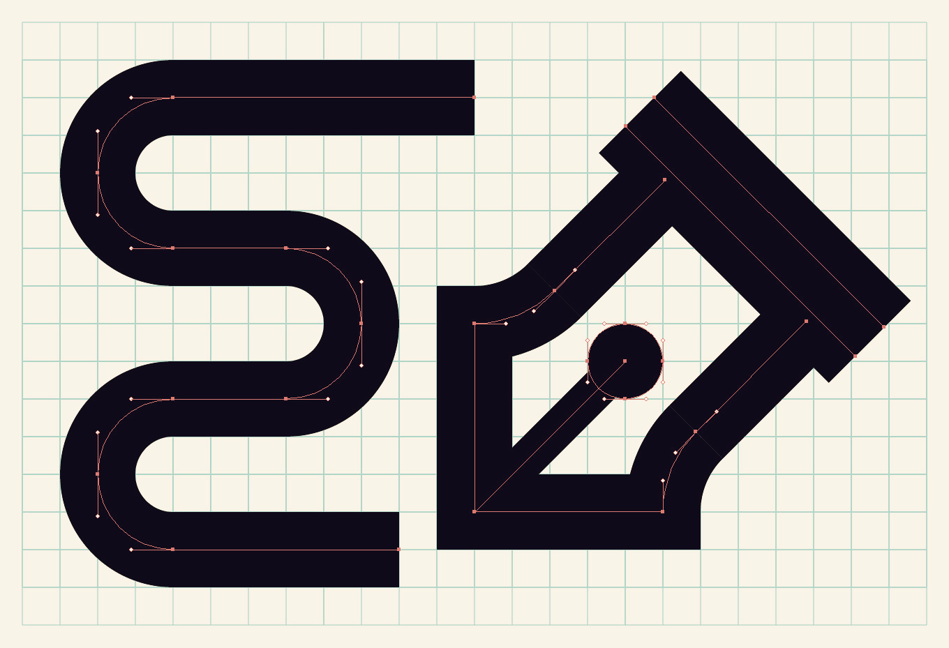
Quick, what’s 9 times 8? Hopefully you thought 72, but if you’re a designer, you may have instinctively shouted “I HATE MATH!” Most of the designers and design students I know claim math as a weakness, but I have never understood why. Math and geometry are used so much in graphic design, it can’t be avoided. Geometry IS design and should be embraced as a wonderful tool for creating order. Circles, squares, and hexagons, along with arcs and lines based on these and other shapes, can be used to create geometric illustrations and type. The inherent anatomy of these shapes calls for a grid to be used as a guide. The grid helps to unite a composition by creating an underlying, semi-visible structure.
I drew this UNT monogram logo on a grid using an 18 point stroke weight and the line tools in Adobe Illustrator. The strokes were then outlined and some slices were added to create the appearance of overlapping.
Drawing with stroked vectors by using the line tools is the best method for creating single-line-weight letters and illustrations. One issue that arises from working this way is that the grid and stroked elements don’t often line up. The disparity comes from the differing default measurement systems between the grid, which is measured in inches, and strokes, which are measured in points. While the two measurement systems might appear to be unrelated, those in the know remember that 72 points equal one inch. With that fact in mind, and starting from the default grid in Illustrator (1 inch grid with 8 subdivisions), some quick math (8 x 9 = 72) will tell you that if you base your strokes off of the number 9, your strokes will align with the grid after being outlined. I have found that doubling the number of default subdivisions works even better with a 9 point stroke. Here’s why: the lines you will be drawing are going to be running along your grid. A 9 point stroke is equal to 1/8 of an inch (.125 in), but that means your stroke will be straddling the grid the same way the stroke straddles the vector line. It is equal to one unit, but the outlined stroke is not hitting the intersections of the grid. By doubling your subdivisions to 16, you will ensure that an outlined 9 point stroke will be hitting the grid on all sides. Don't forget to select Snap To Grid from the View menu when working this way.
This example illustrates why you either need to double your grid subdivisions or your stroke weight. Use the arc tool (hidden behind the line tool in Adobe Illustrator) to create quarter-circle arcs.
After doubling the grid subdivisions to 16, a 9 point stroke covers the width of two grid units. You could also keep the subdivisions at 8 and double the stroke weight to 18 for the same effect.
I created a guide to help anyone seeking to work this way. The chart below shows the relationship between the number of subdivisions in the grid and stroke weights. The numbers located at the intersections of these two values represents the number of grid units your stroke weight will cover. On the left half of the chart, the grid is divided by multiples of 8. Stroke weights that are multiples of 9 will snap with this grid. If you would prefer to use stroke weights in multiples or halves of 8, then use the chart on the right instead. You can flip the subdivisions and stroke weights depending on your preference. As long as one is in multiples of 8, and the other is in multiples of 9, your strokes and grid will flow together.
Click on the image above to get a better look, or download it as a PDF using the button below. You can print it out if you like!
It took me a while to understand all this math, but working this way has become much more intuitive after some practice. You shouldn't attempt to create geometric design with guesswork. Figure out the math, and your designs will be beautifully precise.


