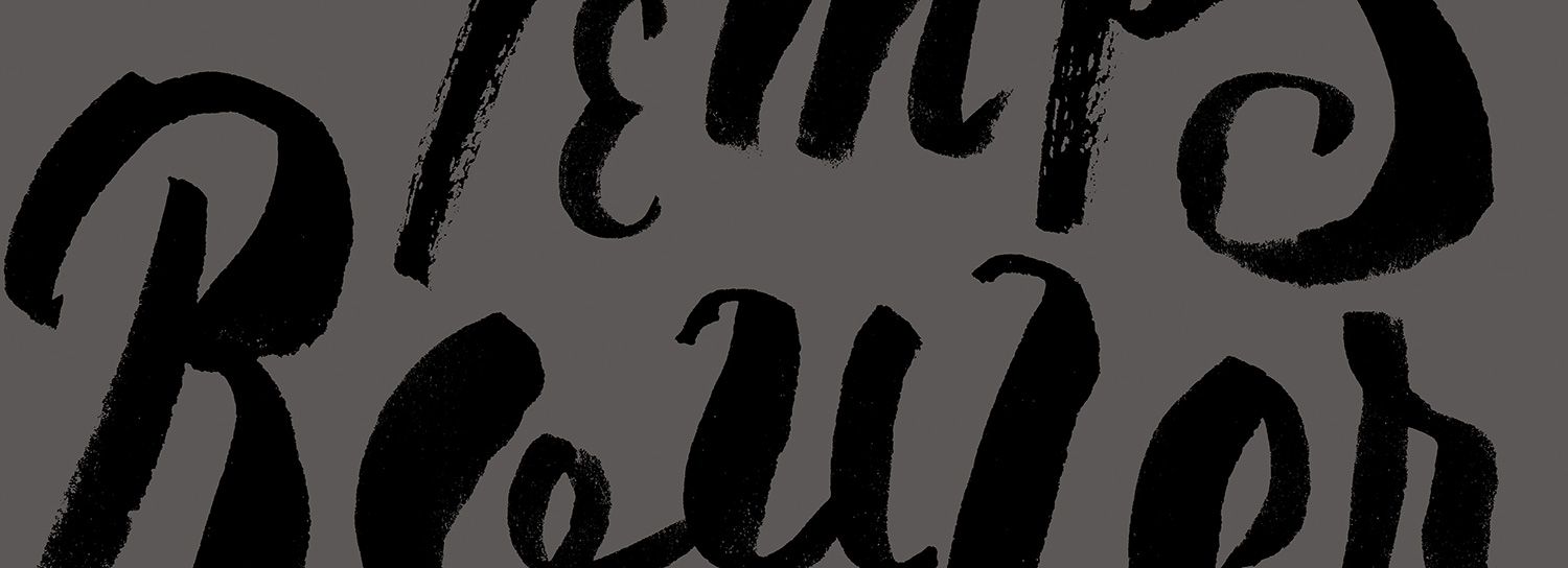
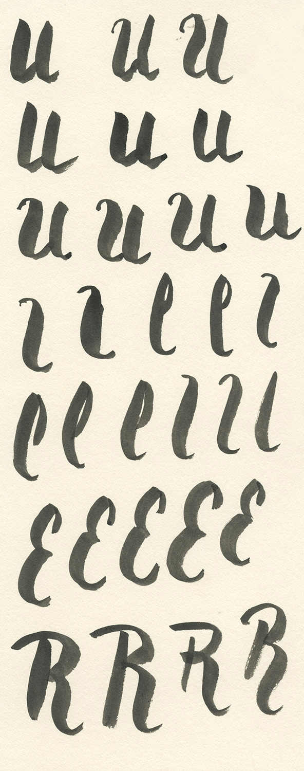
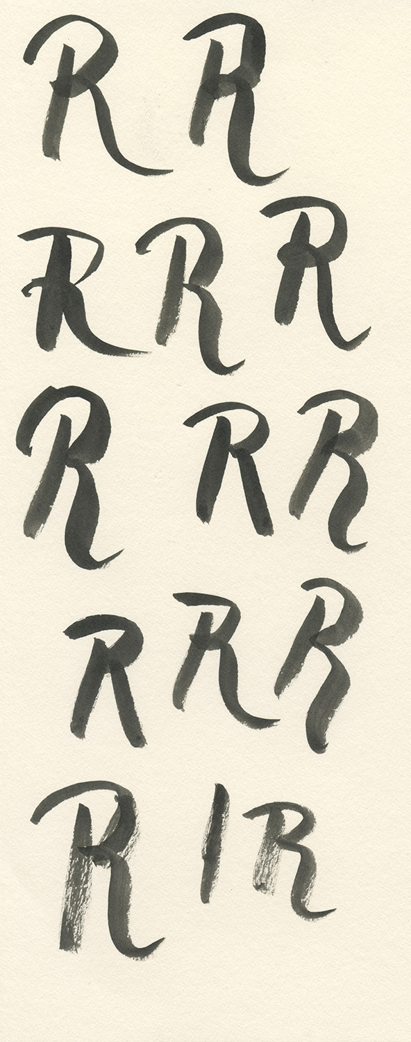
In case you don't speak French (and you're too lazy to use Google), "Laissez Les Bon Temps Rouler" means "Let The Good Times Roll". It's a popular saying in my home state Louisiana, especially around Mardi Gras season, that encourages people to remember to enjoy life at all times. I have wanted to create a print with this phrase for a few years, so I'm pleased to have finally gotten to it. This is the second print in my Wisdom of Words Project–a yearlong series of handcrafted typography prints. You can see the first print in the series here. I decided to use a brush script style for February's print. This lettering style is a perfect fit for the meaning of the text–that life is never perfect, but it's full of fun and energy. To create the art for this print, I used a small, pointed brush and some india ink. Rather than trying to get each letter perfect in one amazing attempt, I drew each letter individually many times and then later combined them into the final composition. This technique is surprisingly easy, given that you draw some fantastic letters. The result is a hand-drawn, energetic typographic brush style with natural textures.
I created pages and pages of letters, drawing each one until I was confident that I had a few good ones. I especially focused on getting good thick to thin contrast within the strokes. I also made an effort to work the ink until it started to run out of the brush, that way I would get some dryer strokes that were more textured.
I spent about two hours drawing all of the letters. I then scanned each page at a very high resolution (1200 dpi). With the letters in a digital format, I selected the best of each one and brought it into a new document, keeping a bit of the original paper that surrounded them.
The image above is a composite showing the letters surrounded by their initial paper texture. Each letter was placed on a different layer in Photoshop and given a Multiply transparency. This method allowed me to move, resize, and rotate each letter exactly as I wanted.
After the layered image was complete, I used the Threshold adjustment to push each letter to pure black and white. I wanted to retain a bit of the original texture within each letter, while keeping the letters heavy and black. The final screen print will use silver and black ink on a red paper. I'll post images of the printing after I get that finished.


