Head over to the store today for my huge Halloween sale. All items are 50% off when you enter TRICKORTREAT at checkout.
Prairie Arts Festival Poster
I am honored to be this year's featured artist for the Prairie Arts Festival in West Point, Mississippi. The festival is Saturday, August 31, and will feature a ton of great local artists, vendors, and musicians. I designed and silkscreened this poster for the event in a limited edition run of 50 prints. The poster is available to purchase over in my store. I filmed the printing using Vine on my iPad, so the quality isn't great, but it's still a fun, behind-the-scenes look into my studio.
Poster detail.
It's A Wood World After All
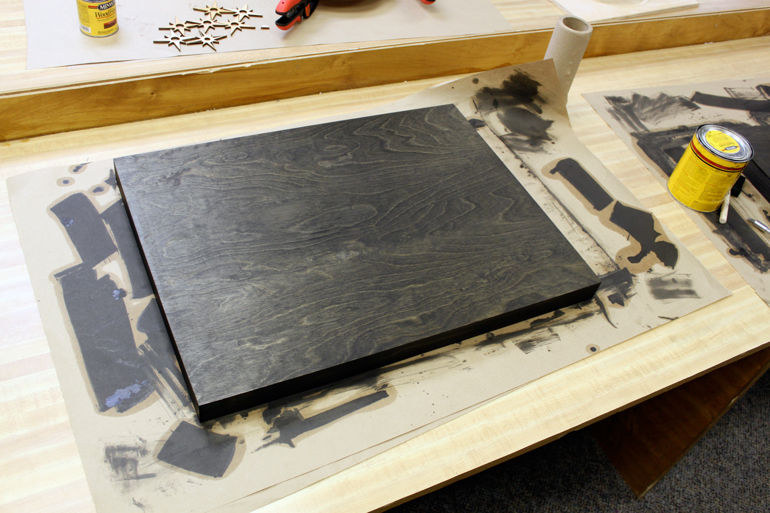
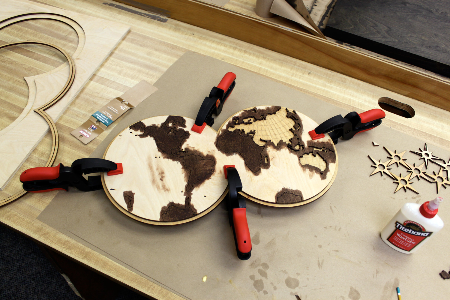
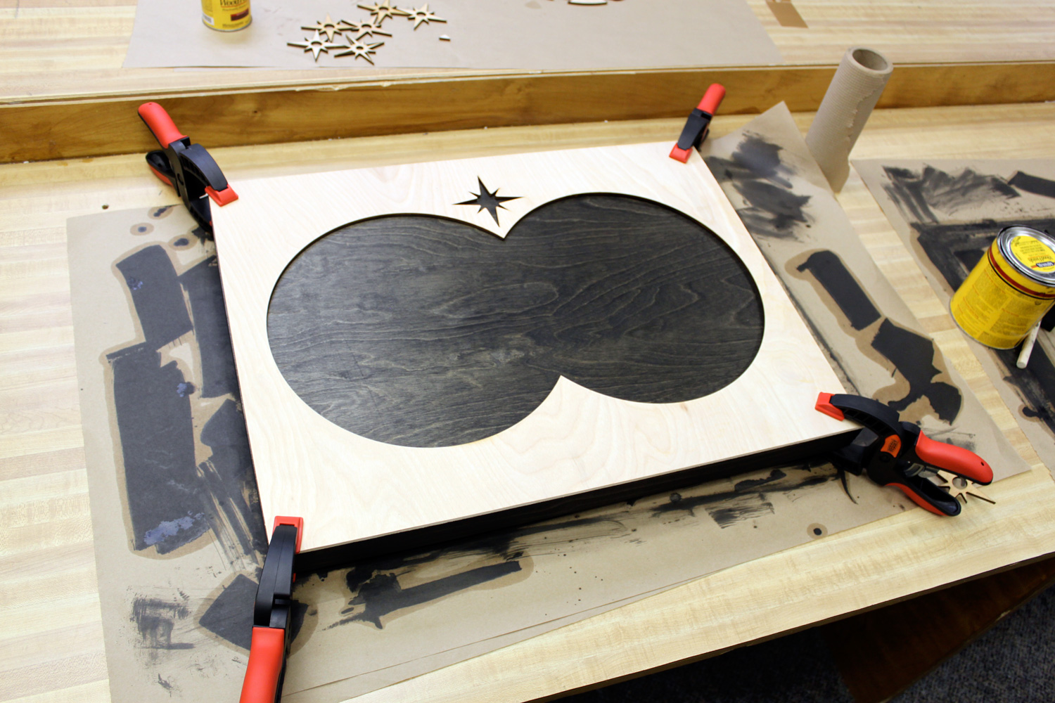
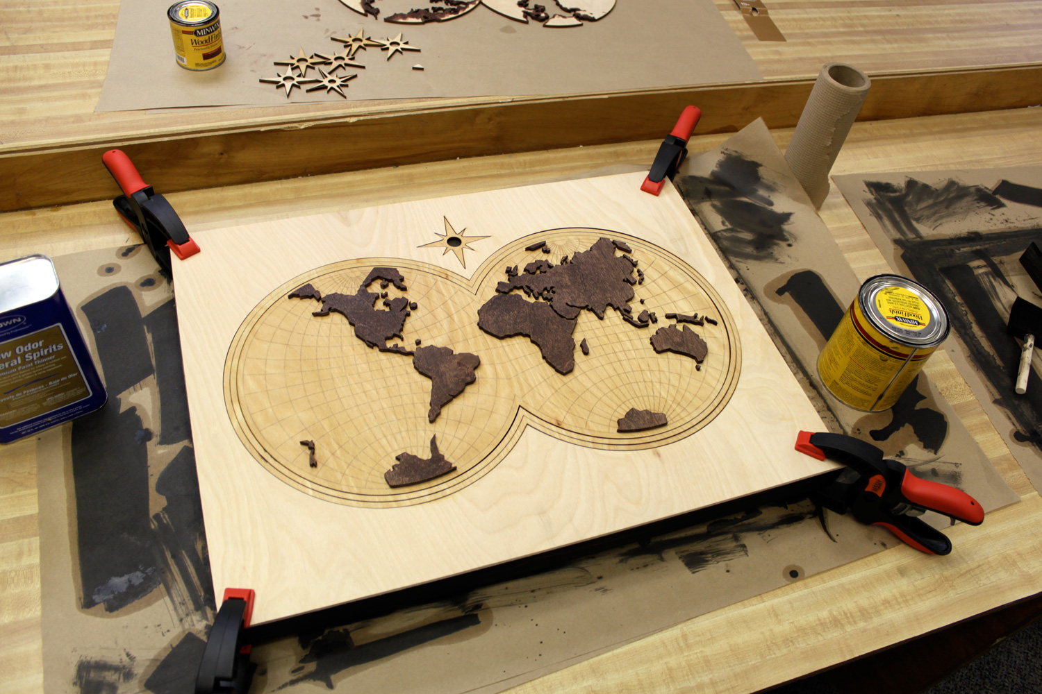
This weekend, June 1, 2013 I'll be selling my handmade goods at the Porter Flea event Aircraft in Nashville. Each of the vendors was asked to create a unique item for the event, and I'm excited to reveal my creation: a wooden world map. If you've been following my work the past year, you'll know I've been experimenting a bit with some lasercut wood wall art. My past creations up to this point have been fairly small, and I decided it was time to go bigger. Each layer is made out of birch plywood, which was lasercut, stained, and glued together. The map is 24 inches wide by 18 inches tall, and features a hollow back with a wire hanger. You may recognize the map from my bicycle map illustration. I only made one of these, and it will only be available at Aircraft this weekend. I made sure to take some images of the process, which you can see below. If you'll be in Nashville this weekend, please stop by my booth!
A Beautiful Gift
Last week I saw an image of a hand-painted saw online by Zachary Smith and I reposted it on my Facebook wall with the comment, "I need this for my wall." My lovely wife Alisha saw that comment and decided to totally shock me by purchasing the saw for me! The original had been sold so Zachary was kind enough to create another, slightly different one for me. Zachary is only 20 years old, but as you can see, he's very talented. I'm so grateful to have this now hanging in my office.
Makers Gonna Make Tattly
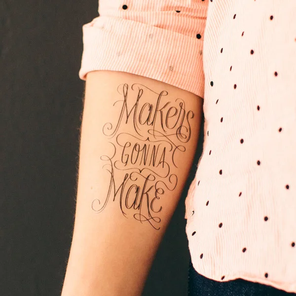
I'm thrilled to announce that the "Makers Gonna Make" lettering I designed has been made into a temporary tattoo by the fine folks at Tattly. Tattly is a temporary tattoo store for design-minded kids and kids-at-heart. You can check out some images of the tattoos below, and you can purchase some for yourself or your friends here. I have to thank Tina Roth Eisenberg for making this happen!
USA T-Shirt Preorder
I'm offering a special deal over in the store. Order a shirt by Friday, March 8th at 12:00 noon CST, and save $5 on your order. These will be hand screen printed with white ink on a Heather Navy Gildan 4.5 oz Softstyle Lightweight t-shirt. This shirt is a preshrunk 65/35 poly/cotton blend, features a slim fit, and is very light and soft to the touch. The shirts will be printed by March 17th and will ship within a week after that. Please allow approximately 3-4 weeks from the time of your preorder for delivery. After March 8th, orders will be accepted but the price per shirt will increase to $20. Shipping for US orders costs $5 and international orders cost $12. Shirts are shipped via USPS.
United States of America Lettering
Here is a peek at some recently completed lettering. Mostly done for fun and to continue to hone my skills, this graphic may eventually work its way onto a tshirt.
New Font in the Works
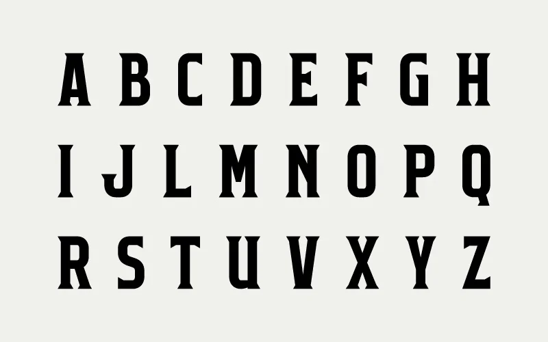
I recently started to build a font and I thought I'd share some process shots. My idea was to build a display typeface in two versions, one with a latin serif and a decorative variant with swashes. Davida, a decorative Art Nouveau font, is an obvious influence. It's one of my favorite guilty pleasure typefaces. I love bold condensed typefaces for display settings, and I wondered if I could create a condensed version of Davida. Each letter is drawn from scratch, or is being built out of a few modular pieces. The typeface then grew into this two weight idea, one with the swashes and one without. Below you will see the regular weight, though I haven't finished the K or W yet.
One of the problems I encountered was that when one condenses the letters, there is much less space for a ball in the counter space. I want to keep the balls in the counter as much as possible so tight spacing will still be possible. There are no plans for a lowercase at this point. I need to complete a few letters, the numbers, symbols, and then all the spacings. It's tedious but I enjoy seeing the results. The hardest part will be thinking of a satisfactory name for my font that has not already been used.
Holiday Porter Flea
I'm pleased to announce that I'll be a vendor at this year's Holiday Porter Flea on Dec. 1 at Nashville's Marathon Music Works. Porter Flea is a modern handmade market with a huge selection of unique items made by a variety of talented artists. For more information visit their website.


